The Transparency Problem
Splitting bills with friends should be easy, but it's often opaque and frustrating. Everyone has different preferences—some want to split everything evenly, others only pay for what they ate, some split the tip equally but not the food. Existing apps make this worse: terrible UX, forced account creation, and app downloads just to view a split. I once watched a friend use one of these apps at dinner, and the experience was so bad it became a running joke. I built Split/Bill to be the opposite: transparent, flexible, and as frictionless as the meal itself.
The No-Friction Solution
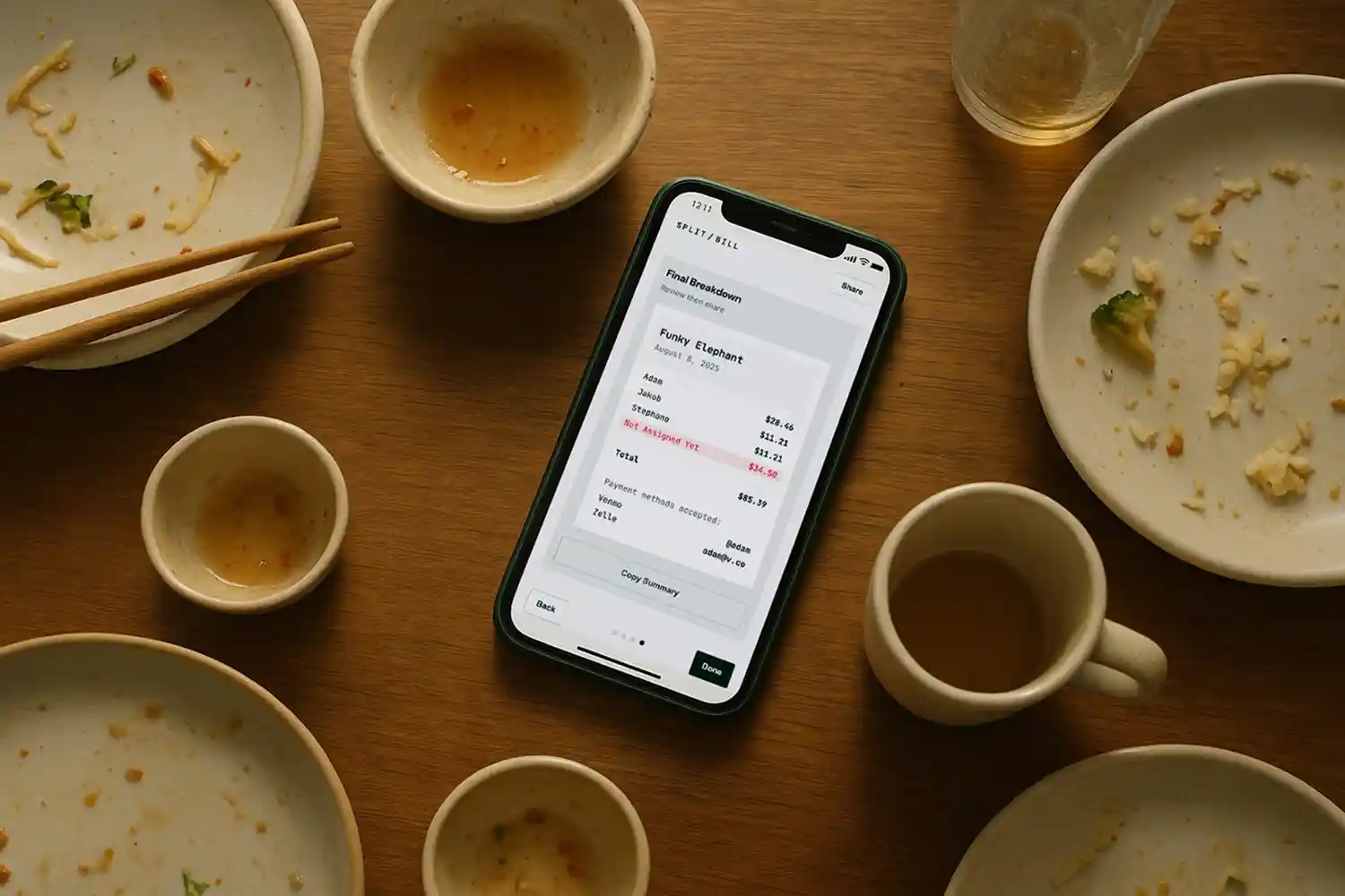
The app is mobile-first and works entirely in the browser—no downloads, no accounts. You create a split, scan the receipt with on-device OCR (Tesseract.js), assign items to people, and share a link via text. Recipients can view and edit the split without signing up. It supports multiple splitting modes (itemized, even split, hybrid) and handles fractional splitting—critical for shared items like pizza. This was a UX challenge: how do you let someone claim "2/3 of the pizza" without the interface feeling like a math test? The solution was a simple slider with real-time recalculation. Users settle payments off-platform to preserve privacy and avoid the friction of integrated payment flows. Built with vanilla JavaScript and Capacitor, it's deployed cross-platform and currently being ported to native Android.
Design Philosophy
The OCR is imperfect—Tesseract.js struggles with receipt quality—but I chose a no-cost option for this bootstrapped project. The next step is experimenting with on-device LLMs to improve accuracy. More importantly, the app prioritizes transparency and user control over automation. By keeping payments off-platform, users choose how they settle (Venmo, Zelle, cash) without the app dictating the experience. The result is a tool that feels as casual and collaborative as grabbing food with friends.
Split/Bill ↗